GoXam is the first diagram control to be designed from the ground up to be a natural extension of the Microsoft XAML language used in Windows Presentation Foundation (WPF). Essential to this environment are Data Binding and Data Templates. GoXam integrates these concepts cleanly and coherently into a powerful diagramming extension to XAML.
Diagram Models and Data Binding
One of the principal features of XAML-defined presentation is the use of data binding. A diagram control, however, must support more complex features than the typical control.
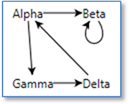
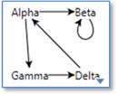
There are at least two kinds of relationships that a diagram can support between data items:
- Relationships forming a graph of nodes and links (or in similar terminology: nodes and arcs, or entities and relationships, or vertices and edges)
- Grouping relationships, where a group contains members; perhaps for part/sub-part containment, or for the nesting of subgraphs
GoXam makes use of a model to discover, maintain, navigate, and modify these relationships based on the data to which the diagram is bound. Not all data behind graphs has the same complexity, so we provide three primary model classes to give you the right blend of ease of use, performance and power.
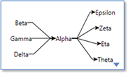
The TreeModel is the simplest model. It is suitable for applications where the data forms a graph that is a tree structure.
The GraphModel is used when each node has a list of nodes connecting to or from that node. The GraphModel also supports simple grouping.
The third model is the GraphLinksModel, where your data includes a source for nodes and also a source for the links that connect them. GraphLinksModel also supports link information that allows different link connection points on each node. It also supports labels on links.
Once a model is created, and the model's data is initialized and assigned to a Diagram, you have created an automatic link between the model and the diagram. Changes to the model update the diagram, and changes to the diagram (typically by the user) update the model.
If you look at our demos, you'll be amazed at how little code you need to write to visualize and update your data.
Data Templates for Nodes
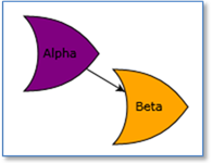
The appearance of any node or link is determined not only by the data to which it is bound but also the DataTemplate used to define the elements of its visual tree. A data template is a reusable piece of XAML that defines how to display your bound data. So the appearance of your diagrams is separate from the code. Simply editing the XAML that defines a node or link can change a diagram's appearance.
Since nodes and links are defined by XAML, it is easy to incorporate all of the power of WPF graphics (rectangles, text, paths, gradients, images, even video) into your diagrams, including the use of animation, storyboards and effects like Blur and Drop Shadow.
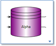
Nodes can be simple using this NodeTemplate
    <DataTemplate>
      <TextBlock Text="{Binding Path=Data}" />
    </DataTemplate>
But it is also possible to define nodes that are as complex as your needs require (click image to see XAML)

Data Templates for Links
GoXam also supports DataTemplate for links, along with links features like Orthogonal, Bezier, rounded corners, jump overs and avoids-nodes routing. (click image to see XAML)
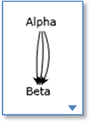
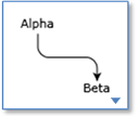
Normal Routing
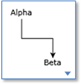
Orthogonal
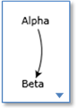
Bezier
with curviness
Round Corners
with AvoidsNodes
Rounded with Jumpovers
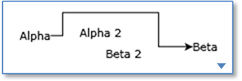
Links with Annotations
It is common to add annotations or decorations to links, particularly text. You can easily add any elements you want to a LinkPanel. (click image to see XAML)
Links support labels
that follow the path of the link
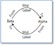
even curvy paths
link labels can be any element
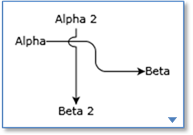
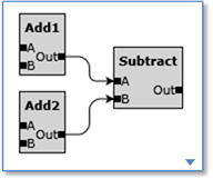
Link Connection Points
By default, links will connect around the edge of a node. (click image to see XAML)
links connect to edge of any shape
or to a specific spot
or to a one or more sides
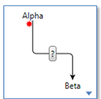
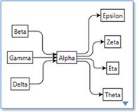
There are times when you want to have different logical and graphical places at which links should connect. GoXam allows you to create a link connection spot out of any element. The elements to which a link may connect are called ports. There may be any number of ports in a node. (click image to see XAML)
Nodes with ports
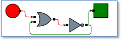
logic diagram with input/output ports